BLOG NAVIGATION
Highscore 2023 Illustration - APRA AMCOS
Posted: 18 September 2023
Updated: 21 August 2024
#illustration
#scifi
#2k23
#gamedev
#poster
#banner
#event
#music
#marketing
#featured
#marketingillustration
#featured
Reading time: 17 min

Industry conference poster marketing designs often fall into repetitive visuals — minimalist shapes, nothing but Helvetica, and ten shades of blue. While these designs may seem safe and approachable for everyone attending, they can set a stale, repetitive tone for the conference. If your event focuses on inspiring creativity, especially in games, animation, cultures, or the arts, stifling interest before attendees arrive is a risk you can’t afford.
Successfully engage conference attendees with marketing design requires:
Instead of viewing a conference poster, flyer, or banner as mere promotional items, see them as extensions of the mental space that visitors will enter. Think of these materials as the equivalent of stepping into a garage, foyer, hall, or garden. One of the best ways to accomplish this is through an illustration of a space.
This article will use the key art illustration for the “Highscore” games music event I completed for APRA AMCOS in 2023 as a case study.
This article will use the key art illustration for the Highscore games music event I completed for APRA AMCOS in 2023 as a case study.
APRA AMCOS, an Australian organisation that supports local musicians in their career development and legal needs, organises a yearly industry event called “Highscore,” which crosses the music and game industries into one specialised program of conference talks.
For the event on 30th September 2023 in Melbourne, I illustrated the key promotional artwork. It needed to be adaptable for social media collateral and split into layers for the video promotion team to animate. Additionally, I provided a frame for speaker profiles.
Below are some of the assets and videos the team put together based on the artworks completed:


The organiser’s theme for the event focused on new technologies and “Tools of the Trade”: techniques and systems that support music and sound practitioners in the game development scene. Topics included audio design for mobile games, analyzing game soundtracks with layered sounds, and introducing industry benchmarks.
Game design music and sound effects represent a niche yet broad industry, encompassing genres from epic sonatas for large-scale stories to tiny 8-bit games on mobile phones. With Highscore running annually, keeping new and existing patrons engaged requires varied representation.
Therefore, to unify all the attendees and businesses attending your event, introducing a third concept outside the usual associations with your audience or industry sparks more interest. For example, music notes are too obvious to represent a music conference.
Instead, consider themes like:
Or explore unrelated words and topics for hilarious ideas, which you can then streamline into something sensible (it’s all about being more creative, right?). Such as:
If a topic is too narrow, expand it. To demonstrate using the above prompts; not all game audio involves water, but most games have atmospheric sounds. So, abstract water/ocean in atmospheric soundscapes to the theme of ‘The Invisible’.
And if a theme is too broad, narrow it down. Such as the above prompt ‘researching inspiring material for projects’, which can come from anywhere such as TV, film, lived experiences, design etc. If we limited it to people’s lived experiences, we could create the theme ‘Reality Creates Fiction’.
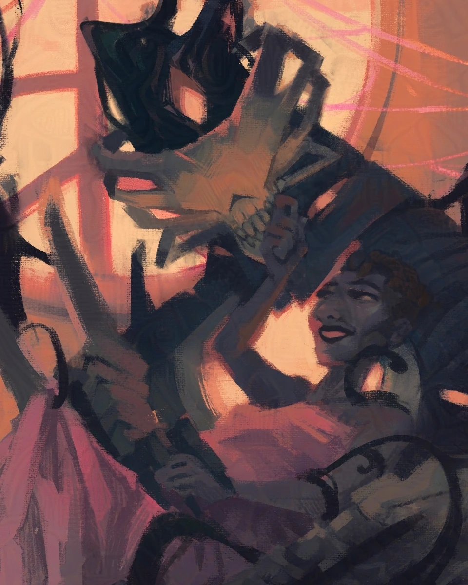
With a specific theme in place, your designer or illustrator can better shape the conference poster. For Highscore’s ‘technology’ theme, I chose science fiction to represent it, which seemed like a relatable visual genre. Not everyone may be a big fan of it, but the cues are universal enough that they were recognisable and at least amusing.
I could have relied solely on modern instruments like Digital Audio Workspaces or electric keyboards to symbolise the genre. But this would’ve been as bland as using only music notes to represent music. Likewise, stale metal hallways, spaceships and lots of cables and wires would’ve been too obvious.
While I used a combination of these standard symbols to communicate the basics, I needed something that would spark curiosity and draw viewers in. I turned to the unexpected shapes found in musical instruments.
Have you worked out what the background in the above illustration represents?
…
It’s the inside of a guitar!


The design of the robots also had specific inspirations. The drum machine (heheh) on the left side is obvious, but the uncommon electric harp inspired the main robot on the right. A classic harp’s frame was too heavy and bulky to invoke something sleek and futuristic.


Pictured: Athy (The Electric Harper). Image source
You don’t need to illustrate designs from scratch to be more creative with your references. Within your theme, look for small, often overlooked details to use as primary symbols. For example:
To uncover the truth of what happened, which harmonies were made dissonant, which chords sprung, what orchestras collapsed, you need cutting edge-tech, and equally as crisp minds.
While using symbols to represent the theme helps catch attendees’ attention and communicate the event’s purpose, but to truly draw them in needs a feeling, conveyed through an underlying story.
Creative conferences naturally become journeys that your attendees are going on; they arrive in a certain state of mind, and by the time they leave, they’ll have acquired new knowledge, experiences and inspiration. When marketing an event, you want to communicate what to expect ahead of time. The best place to start is by writing it down in literal terms:
For Highscore, it might’ve looked something like this:
Much of the design approach and atmosphere will come from the third point, but all three provide a template of the story you’ll be creating a parallel for.
In the case of this illustration, the story parts needed were:
APRA AMCOS didn’t want a violent or destructive approach to the story, however. So, I avoided the common science fiction cliché of a militant science team tearing a mysterious location apart to uncover its secrets, by depicting a team restoring such a location from disrepair, discovering its wonders along the way. I left the details up to interpretation, but the intention needed to be clear: it was a peaceful event and everyone was working together.
An illustration has the advantage of representing the attendees’ journey through a visual space. But getting too carried away with interior design and not enough on story, it will feel too detached. Hence why I chose the thumbnail below where you’re in amongst the people in the frame:

And to further develop the expectations of who to meet at the event, I included diverse characters across cultures, ages, physical attributes, and abilities engaging in micro-stories within the piece:
These also provided the team with crop positions for social media.


If you don’t have a full illustration, consider how chosen symbols and shapes could interact to imply the above story, or give a sense of space. You will probably need to rely more on the next section about colour and style to communicate this.
In contrast with standard conference poster graphic design, which leans towards approachable, my style has a dark tonality, often associated with action-centric stories. This works for events like Highscore because the audience associates darker sci-fi scenes with coolness and excitement, rather than suspicion.
However, to convey collaboration, the colour scheme needed liveliness while retaining the elegant greys of a science fiction setting and the key neon green colour we decided upon. Inspired by how the pieces below work with vibrancy among a muted palette:


My process for striking this balance used a strategy called ‘gradient maps,’ where I start with grey values across the piece, before tinting them various colour shades to establish a starting point for the colour scheme. I then add rudimentary colours to the people and items.


The piece doesn’t look very appealing yet, so from here, I take a step back and experiment with the overal colour temperature of a piece in thumbnail format.

To transfer thumb colours to the final piece, I copied the same filters across. From there, it’s a matter of refining the underlying colours and completing the shading process.


Unexpected colours can give a genre a facelift. In the case of this illustration, the second thumbnail in the top row introduced pinks and off-browns to an otherwise cool space. Against the futuristic green, it shifted the experience of the scene to something more playful.
Of course, nothing brings people into a space more than zooming through it with a virtual camera.
For APRA AMCOS, I provided them with transparent layers of each major section of figures and objects, so they could add parallax, animation and blurring effects as needed.

If you avoid considering a specific theme, symbolism, story, colours, and depth, the resulting conference poster might resemble the illustration I produced for Highscore in 2019:

It may be visually appealing, but lacks depth and exploration. It drew on soundwaves as inspiration, which, as we’ve established, is not enough to create interest on the topic of music. Had I paid more attention to:
The piece would have been more engaging. But I appreciated the opportunity APRA AMCOS provided me with creating for them a second time, with significant improvements.
The strength of event poster illustration or design material for a creative industries event hinges on the effectiveness of its premise. The more you can flesh out that concept and core narrative, the easier it will be to evoke something immersive.
Looking for more illustrations, stories and projects that give you a cathartic kick to the heart? Subscribe to my newsletter!
Receive regular updates on behind-the-scenes goodies and the current project, which you can find out more about here.